> ## Documentation Index
> Fetch the complete documentation index at: https://docs.chemolytic.com/llms.txt
> Use this file to discover all available pages before exploring further.
# PCA
> Principal Component Analysis. Find the directions of maximum variance and detect outliers in your spectra.
PCA (Principal Component Analysis) is the workhorse of spectroscopy exploration. It rotates your high-dimensional spectra into a new set of axes called **principal components**, ordered by how much variance they explain. PC1 is the direction of largest variance, PC2 the next largest (orthogonal to PC1), and so on.
PCA is useful for:
* Spotting **outliers** before training a model
* Visualizing whether your samples form **natural groups**
* Reducing dimensionality for downstream methods (e.g., feeding into K-Means)
* Understanding **which wavelengths matter most** via loadings
## Configuring a PCA run
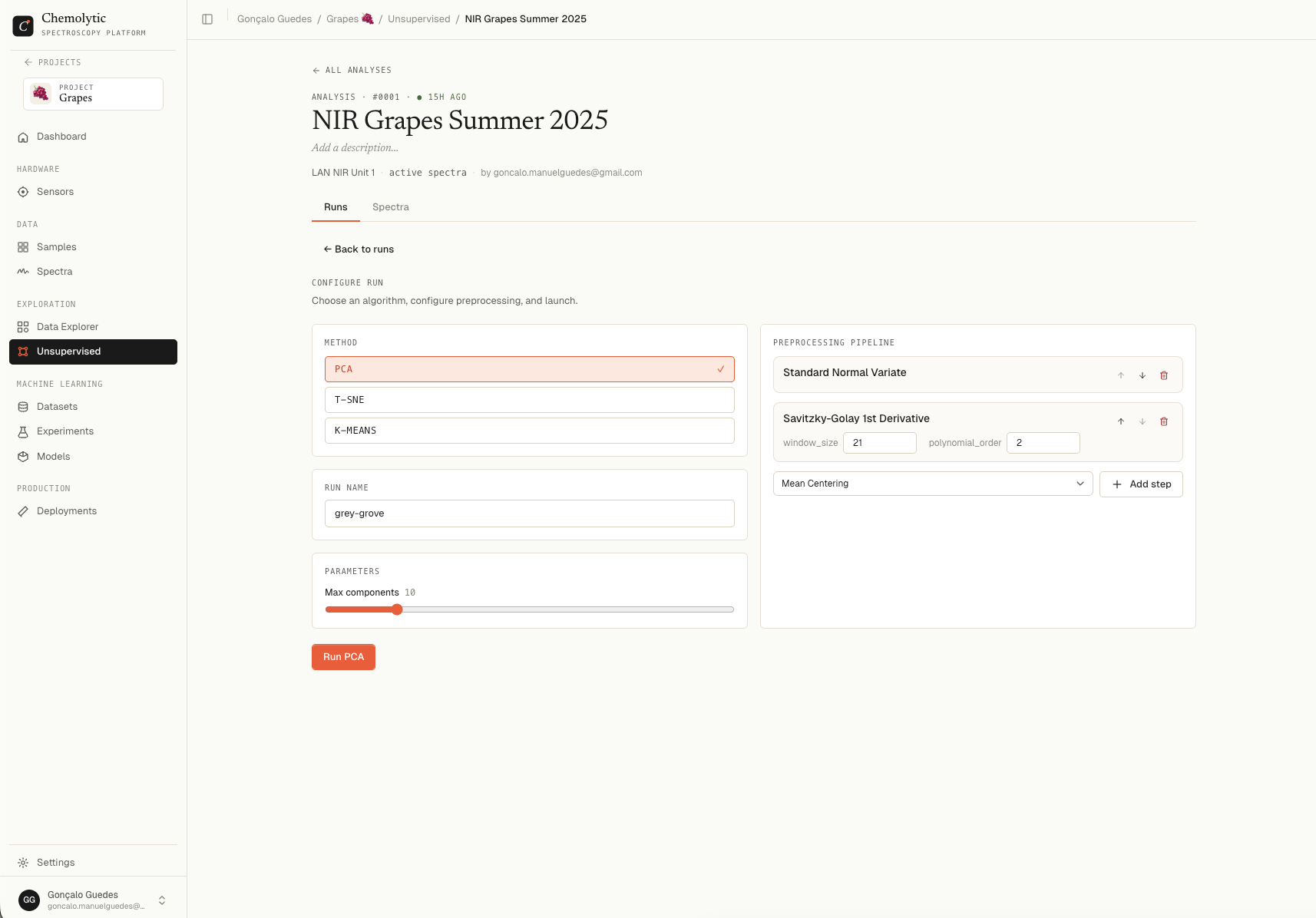
In the **Configure run** card on the analysis detail page, select **PCA**.
 ### Parameters
| Parameter | Default | Range | Description |
| ------------------ | ------- | ------- | ------------------------------------------------------------------------------------ |
| **Max components** | 10 | 2 to 50 | The maximum number of principal components to compute. Higher = more detail, slower. |
The actual "best" number of components is chosen automatically based on the cumulative variance explained.
### Run name
Auto-generated as a friendly two-word name (e.g., "bold-cloud"). Override it with anything descriptive.
Click **Launch run** to start. The run appears in the runs list with status "Queueing", then "Analysing", then "Done" when complete.
## Reading the results
Click a completed run to open its detail page.
### Parameters
| Parameter | Default | Range | Description |
| ------------------ | ------- | ------- | ------------------------------------------------------------------------------------ |
| **Max components** | 10 | 2 to 50 | The maximum number of principal components to compute. Higher = more detail, slower. |
The actual "best" number of components is chosen automatically based on the cumulative variance explained.
### Run name
Auto-generated as a friendly two-word name (e.g., "bold-cloud"). Override it with anything descriptive.
Click **Launch run** to start. The run appears in the runs list with status "Queueing", then "Analysing", then "Done" when complete.
## Reading the results
Click a completed run to open its detail page.
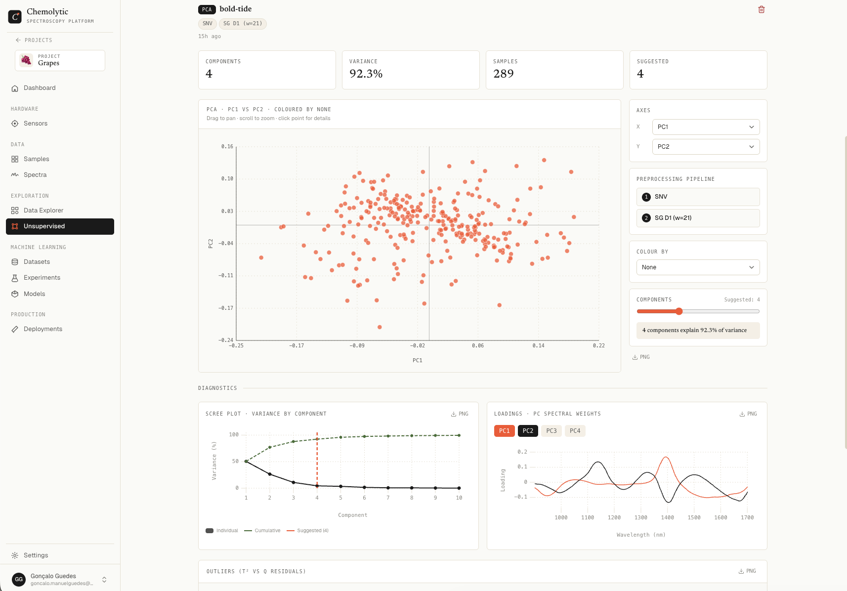 ### Dimensionality (scree plot)
Bar chart showing the **explained variance** of each component, with a line for the cumulative variance.
The text below the chart shows the **suggested number of components** and the cumulative variance at that count (e.g., "Suggested: 4 components · 92.3% variance").
Look for the "elbow" in the bar chart. Components past the elbow add little variance and probably represent noise. The suggested number tries to capture the elbow automatically.
### Scores plot
Scatter plot of your samples projected onto the principal components. Each point is one spectrum.
| Control | Description |
| ------------- | -------------------------------------------------------- |
| **X axis** | Pick which PC is on the horizontal axis (PC1 by default) |
| **Y axis** | Pick which PC is on the vertical axis (PC2 by default) |
| **Colour by** | Color points by a property to spot correlations |
When you colour by a property:
* **Continuous** properties produce a blue → red gradient (low to high)
* **Categorical** properties use a fixed palette (one color per category)
If samples cluster in the scores plot when coloured by a property, that property is correlated with spectral variance. This is a strong signal that you can build a model for it.
### Loadings plot
Line chart showing how much each wavelength contributes to a given component.
Pick which PC to view from the dropdown. Peaks and troughs in the loadings indicate the wavelengths that drive that component's variance. If PC1's loadings have a strong peak at, say, 1450 nm, that wavelength is dominant in the largest source of variance in your data.
### Outlier detection (T² vs Q residuals)
Scatter plot with **Hotelling T²** on the x-axis and **Q residuals** on the y-axis. Each point is a spectrum. Two threshold lines (red) mark statistical limits.
| Region | Meaning |
| ---------------------- | ------------------------------------------------------ |
| Inside both thresholds | Normal sample |
| Above Q threshold | Spectrum has unusual features the model didn't capture |
| Right of T² threshold | Spectrum is at the extremes of the modelled space |
| Above both | Strong outlier candidate |
### Dimensionality (scree plot)
Bar chart showing the **explained variance** of each component, with a line for the cumulative variance.
The text below the chart shows the **suggested number of components** and the cumulative variance at that count (e.g., "Suggested: 4 components · 92.3% variance").
Look for the "elbow" in the bar chart. Components past the elbow add little variance and probably represent noise. The suggested number tries to capture the elbow automatically.
### Scores plot
Scatter plot of your samples projected onto the principal components. Each point is one spectrum.
| Control | Description |
| ------------- | -------------------------------------------------------- |
| **X axis** | Pick which PC is on the horizontal axis (PC1 by default) |
| **Y axis** | Pick which PC is on the vertical axis (PC2 by default) |
| **Colour by** | Color points by a property to spot correlations |
When you colour by a property:
* **Continuous** properties produce a blue → red gradient (low to high)
* **Categorical** properties use a fixed palette (one color per category)
If samples cluster in the scores plot when coloured by a property, that property is correlated with spectral variance. This is a strong signal that you can build a model for it.
### Loadings plot
Line chart showing how much each wavelength contributes to a given component.
Pick which PC to view from the dropdown. Peaks and troughs in the loadings indicate the wavelengths that drive that component's variance. If PC1's loadings have a strong peak at, say, 1450 nm, that wavelength is dominant in the largest source of variance in your data.
### Outlier detection (T² vs Q residuals)
Scatter plot with **Hotelling T²** on the x-axis and **Q residuals** on the y-axis. Each point is a spectrum. Two threshold lines (red) mark statistical limits.
| Region | Meaning |
| ---------------------- | ------------------------------------------------------ |
| Inside both thresholds | Normal sample |
| Above Q threshold | Spectrum has unusual features the model didn't capture |
| Right of T² threshold | Spectrum is at the extremes of the modelled space |
| Above both | Strong outlier candidate |
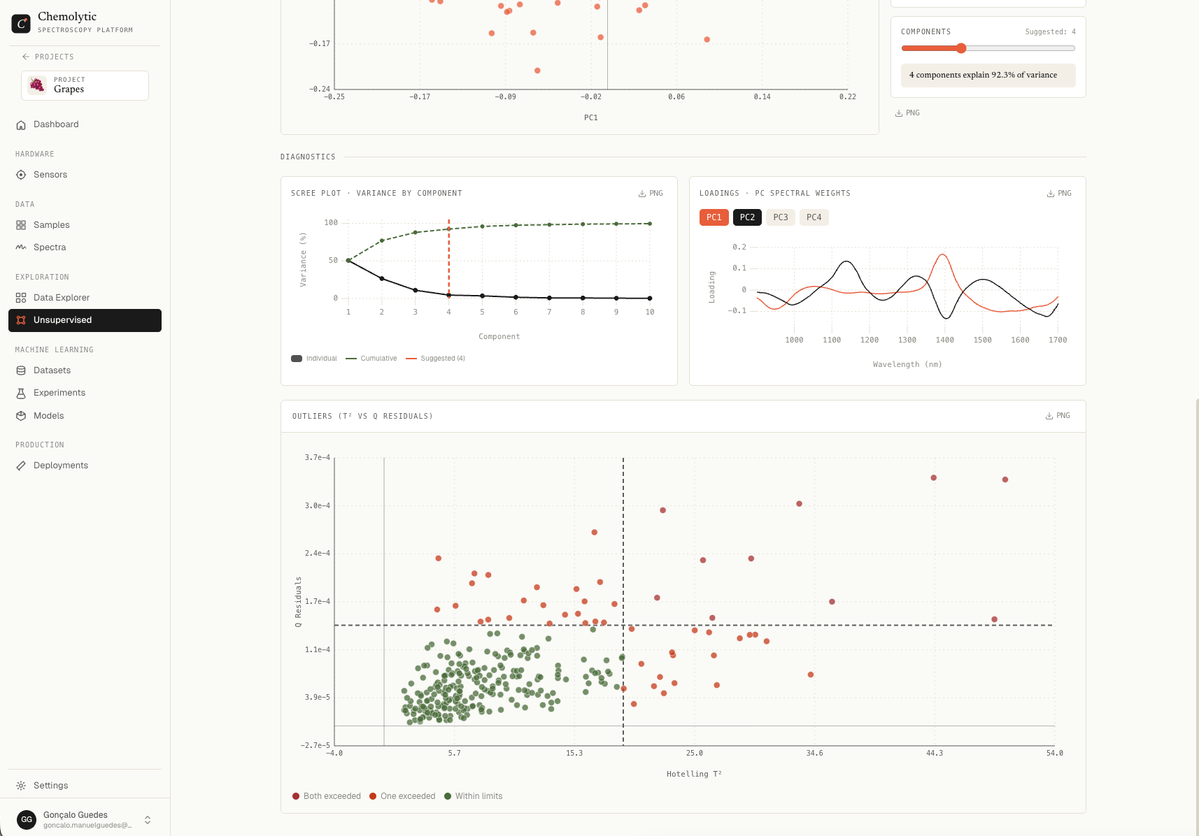 Points are coloured:
* **Green**: inside both thresholds
* **Orange**: one threshold exceeded
* **Red**: both thresholds exceeded
The badge above the chart shows the count of outliers vs total samples.
Click an outlier to identify which sample it is. Investigate the original spectrum and the lab notes for that sample. Common causes: contaminated sample, instrument error during measurement, wrong sample loaded by mistake.
## Iterating
PCA results often suggest changes:
| Observation | What to try next |
| -------------------------------------- | ----------------------------------------------- |
| Strong outliers | Archive those spectra, run again |
| First component captures most variance | Try a stronger preprocessing (SNV, derivatives) |
| No structure visible in scores | Add more samples or check property coverage |
| Property gradient visible | You're ready to try an experiment |
Each new run is saved alongside the others in the same analysis. Use [Comparing runs](/explorer/comparing-runs) to put multiple runs side by side.
Points are coloured:
* **Green**: inside both thresholds
* **Orange**: one threshold exceeded
* **Red**: both thresholds exceeded
The badge above the chart shows the count of outliers vs total samples.
Click an outlier to identify which sample it is. Investigate the original spectrum and the lab notes for that sample. Common causes: contaminated sample, instrument error during measurement, wrong sample loaded by mistake.
## Iterating
PCA results often suggest changes:
| Observation | What to try next |
| -------------------------------------- | ----------------------------------------------- |
| Strong outliers | Archive those spectra, run again |
| First component captures most variance | Try a stronger preprocessing (SNV, derivatives) |
| No structure visible in scores | Add more samples or check property coverage |
| Property gradient visible | You're ready to try an experiment |
Each new run is saved alongside the others in the same analysis. Use [Comparing runs](/explorer/comparing-runs) to put multiple runs side by side.